The Return of Earthy Tones
Something ancient is happening in our living rooms, on our runways, and across our feeds — the earth is calling its colours home.
There is a certain irony in the fact that the most forward-looking design movement of 2026 is also the oldest. Terracotta, ochre, raw umber, sage, warm ivory, deep sienna — these are the pigments of cave paintings, of handmade pottery, of sun-dried adobe walls. And yet they are everywhere right now: draping furniture showrooms in quiet warmth, running as base notes through the season’s most talked-about fashion collections, and anchoring the mood boards of interior designers who are finally, collectively, done with the cold sterility of the previous decade.
The cultural swing makes perfect sense when you trace it back far enough. After years of millennial pink, Gen Z yellow, and the hyper-saturated maximalism of the early digital age, people are exhausted. Exhausted by noise, by performance, by the relentless demand to be vivid. Earthy tones are the antidote — they ask nothing of you. They simply exist, warm and grounded and unhurried.
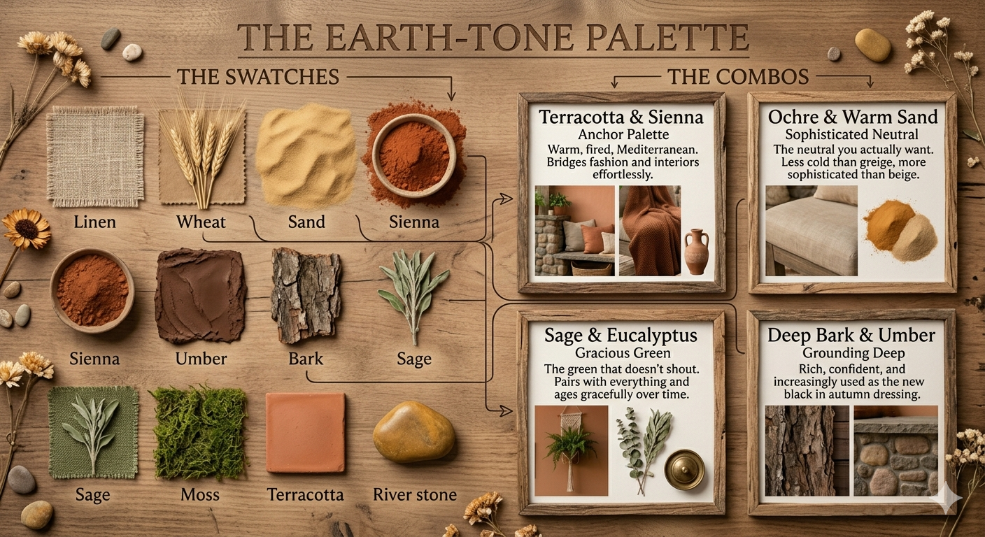
The palette, defined
When designers talk about earthy tones today, they mean something broader than simple brown. The current palette is layered and nuanced — a full ecosystem of colour drawn from soil, stone, bark, moss, and mineral.
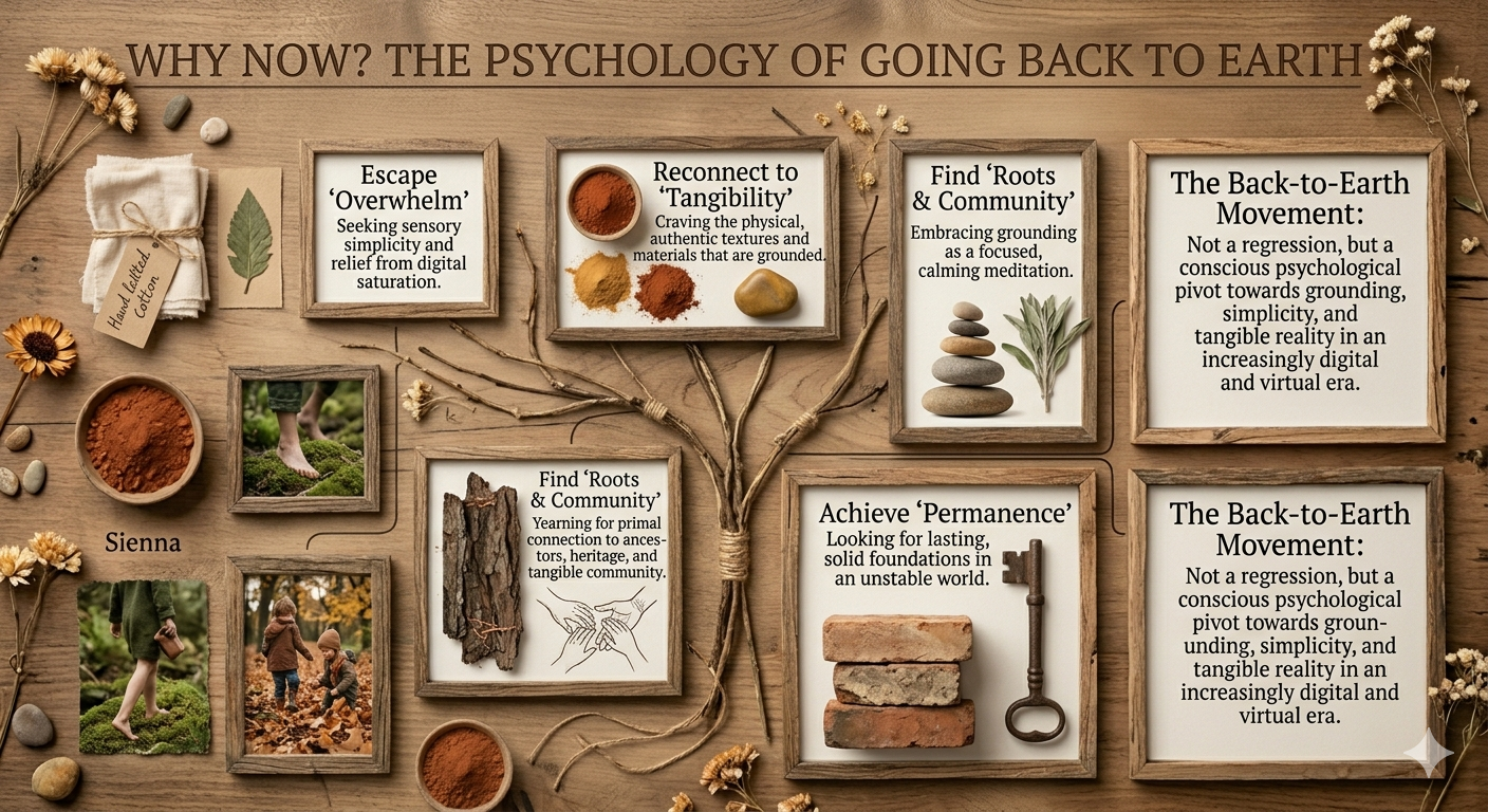
Why now? The psychology of going back to earth
Colour psychology has a lot to say about this moment. Earthy tones are inherently grounding — literally. Our nervous systems recognise these colours from millions of years of living close to soil, bark, and stone. They signal safety, warmth, and the slowing of time. In an era of ambient digital anxiety, that signal matters more than ever
“We are drawn to the colours of things that have existed longer than we have. There is a quiet dignity in ochre — it does not chase attention, it simply endures.”
— Colour Trend Report, Design Week 2026
There is also a sustainability dimension that cannot be ignored. The earthy palette is philosophically aligned with the slow design movement, with natural materials, with buying less and choosing better. When a designer reaches for raw linen in warm ecru, they are making a statement about permanence — this piece will not feel dated in three seasons because it was never chasing a trend in the first place.
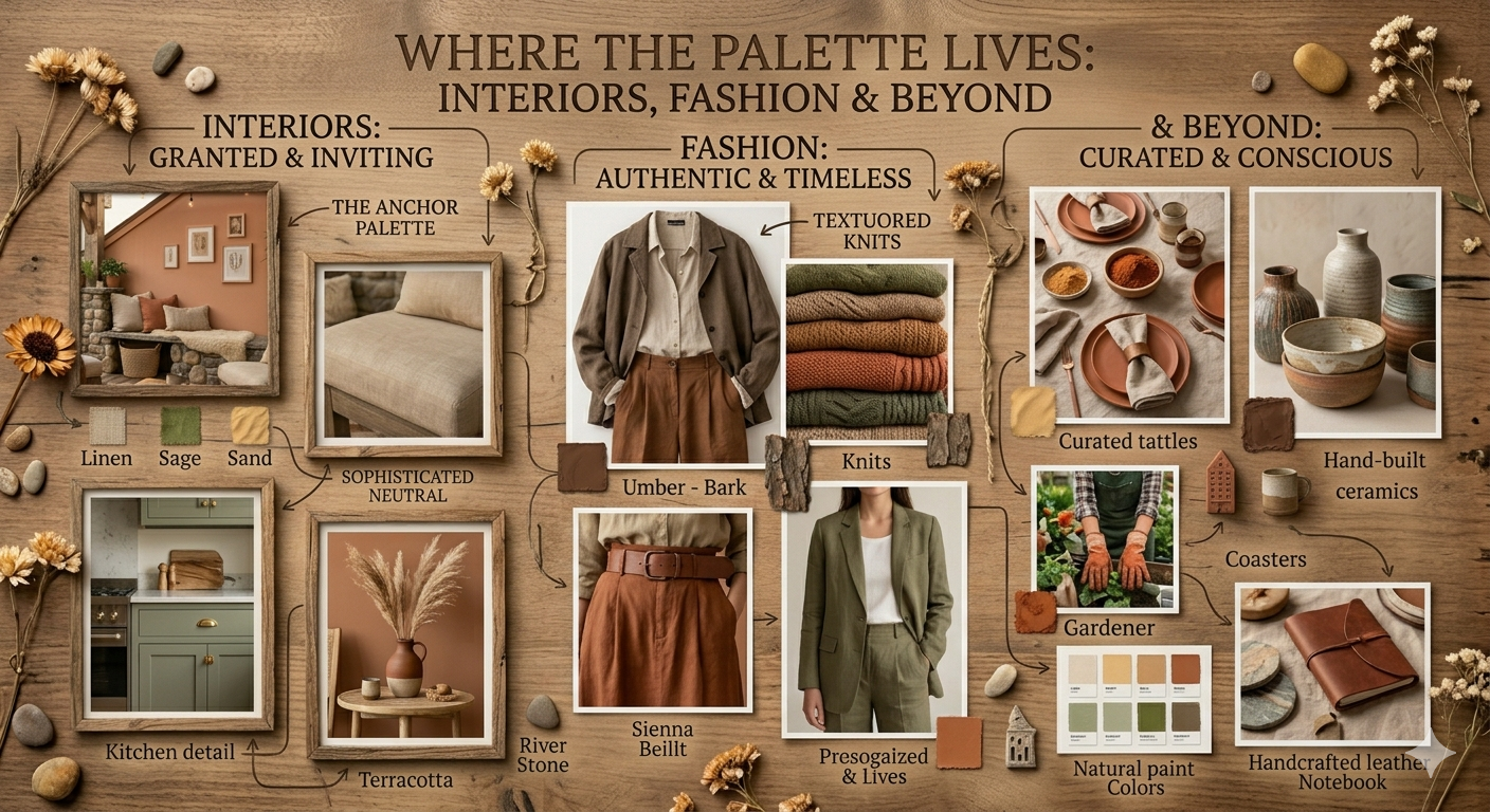
Where the palette lives: interiors, fashion & beyond
Interiors. This is where the earthy revival is most dramatic. The all-white wall is not dead, but it has acquired warm company: mushroom plaster finishes, limewashed terracotta accent walls, rattan, jute, and linen in every surface. The look is layered but never cluttered — depth through texture rather than colour saturation.
Fashion. The runway has been speaking earthy for two consecutive years now, with the current season doubling down. Monochromatic earth-tone dressing — a single column of ochre or sienna from collar to hem — is having its biggest moment since the 1970s (the last time this palette dominated). Jewellery has responded with raw stones: rutilated quartz, smoky topaz, amber.
Digital & brand design. Perhaps most tellingly, digital-first brands are migrating away from the bright, flat, high-contrast colour schemes of the 2010s toward warmer, more textured visual identities. Off-white backgrounds with warm undertones. Typography set in shades of deep umber rather than pure black. It reads as mature, considered, and human.
Why now?
Earthy tones are inherently grounding. Our nervous systems recognise these colours from millennia of living close to soil and stone — they signal safety and the slowing of time. There is also a sustainability thread: the earthy palette aligns with slow design, natural materials, and permanence. A raw linen piece in warm ecru will not feel dated in three seasons because it was never chasing a trend.
“We are drawn to the colours of things that have existed longer than we have. There is a quiet dignity in ochre — it does not chase attention, it simply endures.”
— Colour Trend Report, Design Week 2026
How to work with it
The one risk is flatness. The fix: contrast through depth, not brightness. Use the full range of the palette itself.
Go dark to light
Bark cushion against raw linen. Umber leather beside bleached wheat. Depth, not drama.
Add a sage note
Sage green reads cool against warm tones — a chromatic surprise that never breaks the mood.
Warm metallics
Burnished bronze or raw brass bridges the ancient palette to the present without nostalgia.
Let texture talk
Ribbed knit beside smooth stone. Rough jute beside polished clay. Texture does colour’s job here.
Swati Suman · April 18, 2026
5 min read · Design & Style